
FOCO: Rebrand
A brand and packaging redesign for FOCO Lychee, reimagined with a modern tropical identity.
Timeline
5 Weeks
Role
Brand Strategy
Logo Design
Packaging
Social Media
Tools
Adobe Illustrator
Adobe Firefly
Adobe Express
Adobe Premiere Pro
Team
Individual
This is an independent academic project, unaffiliated with FOCO or Thai Agri Foods. I selected FOCO for its untapped potential in a design-driven beverage market.


Overview
Repositioning a tropical beverage for a modern market.
FOCO is a Thai lychee drink sold in North American grocery stores. While the product has a strong tropical flavour, its packaging and brand presence blended into the imported beverage aisle. This project reimagines FOCO as a modern tropical brand with clearer shelf impact, stronger social appeal, and a visual identity designed to connect with 18–34 consumers.

The PROBLEM
On shelf
Lost on shelf
On shelf, FOCO blended in with other imported beverages, making its tropical flavour and unique product story less immediately visible to first-time shoppers.


Online
No social presence at all
No dedicated fruit drink account. Visibility came entirely from retail listings on Walmart and the parent company's site.
Packaging audit
Vague product type “LYCHEE DRINK” is unclear (juice? nectar? sparkling?)
The wordmark feels functional rather than flavour-forward.
No clear differentiation.
Communicates no compelling benefit, product claim, or reason to choose.
Weak text hierarchy
Similar colour and type cause the logo and product name to compete, reducing scanability
Not distinctive
Design looks like a standard import can.

MOGU MOGU
Gen Z target, K-Pop ambassador. Had a bold visual identity that worked on shelf and on social.
FOCO
Same category, but packaging and digital presence felt functional over lifestyle-driven.


Core Insight
A tropical flavour with room for stronger visual storytelling.
FOCO’s lychee drink had a strong tropical flavour, but the brand did not visually express that feeling. The opportunity was to turn the product’s refreshing, tropical quality into a stronger shelf and social identity.
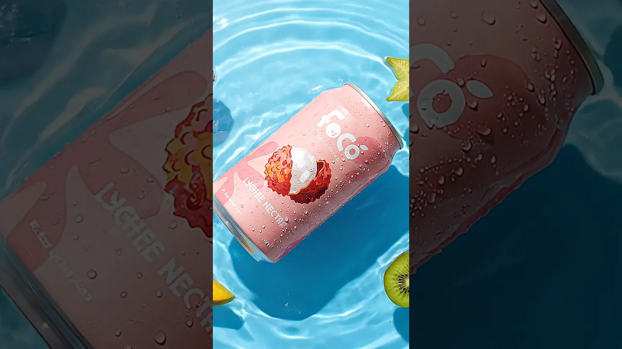
THE BIG IDEA
Modern & tropical.
A fresher, more intentional tropical brand built to stand out beyond the imported beverage aisle.
Strategy
Introduce a modern tropical colour system, clearer typographic hierarchy, and a cohesive wordmark to strengthen FOCO’s shelf presence and brand recognition.

LOGO REBRAND
OLD LOGO
NEW LOGO

®

IDEA BEHIND THE MARK
Exploring a Fruit-Inspired Wordmark
FOCO is a coconut water brand centered on natural ingredients. I began by sketching letterforms that embedded fruit references directly into the wordmark, exploring the C and O as coconut cross-sections and the F as a leaf. I chose a wordmark approach over a pictorial mark to keep the brand name legible and recognizable across small formats

Logo Combination
The logo combines three brand cues: the FOCO wordmark for recognition, a coconut-inspired “O” to reference its tropical flavour identity, and a simplified leaf detail to suggest natural ingredients. Together, these elements create a more distinctive logo while keeping it clean and readable.
Iconic flavour
Natural ingredients
Brand Name
FOCO
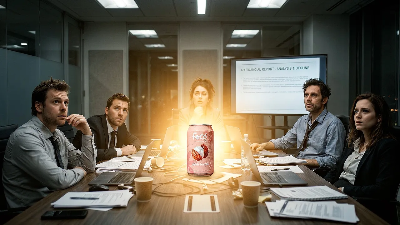
MARKETING STRATEGY
Turn taste into a repeatable campaign idea.
Inspired by the feeling of opening FOCO Lychee and briefly feeling in Thailand, One Sip and You’re in Thailand turns that experience into a short-form comedy campaign. Each video follows one simple idea: one sip makes Thailand feel suddenly close.

Takeaways
Strategy Before Aesthetics
This project required me to approach design as a business problem first. Before any visual work, I audited FOCO's market position, identified gaps in shelf presence and digital reach, and benchmarked against a direct competitor. That research directly informed every creative decision: the logo construction, the packaging hierarchy, the social strategy.
Next Project…

Burger Ops
Scenario driven card game that turns service design methods into play through real fast food service challenges. (GBDA 204)